8 Expert Tips For Image Content Use In 2023
Social networks have become a massive part of our lives. Users share content to connect with their peers, support their favorite brands, and share their opinions with the world. In this post, we share expert tips from renowned marketing professionals on creating social media content that will reach the masses and drive business for you. Below we discuss expert tips for image content.
Tips for image content
1.Color
Color is one of the most important and complex aspects of any social media design. Color schemes not only help draw attention to an ad, they help set the tone, create an atmosphere, convey emotion and in some cases tell a story. The ad uses not only different colors but also different shapes because each one is a little different, confirming that everyone communicates in their own unique way.
2.Balance
In the image, different elements carry different forms of weight, paying homage to the four types of balance
- Symmetrical.
- Asymmetric.
- Radial.
- Crystallographic.
The glasses are perfectly centered on the marble background, which not only helps the glasses stand out with the contrast created, but the balanced look of the glasses implies the perfect vision that the customer will experience when purchasing.
3.Lines
The best use of lines in advertising helps guide audience members on their visual journey. You can use straight lines to add a sense of order and order to an image, while crooked or curved lines can give an image a sense of movement.
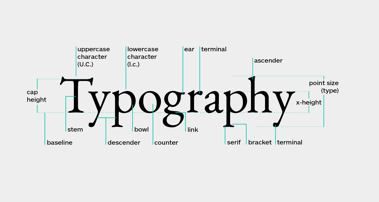
4.Typography

While you want your ads to stand out when using fancy typography, it’s also important to consider readability. The whole point of advertising is to communicate your product to your audience, so it does no good if the font is illegible. Choosing the perfect font or set of fonts to complement your images can really bring your social media ad to life.
5.Contrast
The use of contrast in online advertisements provides distinction between elements so that the overall image stands out or stands out. It’s also important to follow the idea of less is more, as the design can also easily become too cluttered due to too much contrast it’s all about balancing the image with the following three contrasting elements:
- Contrasting colors.
- Contrasting shapes.
- Contrasting sizes.
6.Scale
There is so much you can do with scale. Scale allows designers to zoom in or out on an object, focus on certain elements, and allow your audience to understand an ambiguous concept or object. In the ad below from Avnet, the company chose to highlight one of their microcontrollers by zooming in on one of their boards, giving customers a better idea of how they can program with the CPU core, memory.
7.Proximity

Proximity involves grouping items together to create a sense of organization in the design. When he groups together similar or related elements, he creates a relationship and continuity between them, which brings an appearance of order.
8.Repetition
An easy way to grab your audience’s attention and improve your social media images is to use the concept of repetition, also known as consistency branding. Being successfully repeatable without crossing the line into monotony means being consistent with fonts, colors and logos. Using these three elements gradually over time will give your brand a unique look and be easily recognizable to your target audience.
Conclusion
You can be as creative as you want with the slides, but if you ignore the basics, it’s a useless process. Google is the king of associations therefore, there’s a lot you can do to better match search intent and maximize the search relevance of your visual content, from aligning featured images with the context of your written content to proper file naming, descriptions, and tagging.


Leave A Comment
You must be logged in to post a comment.