A Practical Guide To Ecommerce Web Design For 2023
The marketing industry believes that retailers should understand that if you do not have an e-commerce site, your business is almost completely out of reach of a large number of buyers. It is not just big retailers that are benefiting from increased customer demand for online shopping. Consequently, if you too are an e-commerce business, here is how you too can join the growing number of businesses that routinely exceed their annual e-commerce sales goals. Below we discuss some ecommerce web design.
Ecommerce web design
Presentation
An effective eCommerce website relies primarily on presenting your products and services to visitors. Visuals are therefore essential to communicating your brand message. The presentation of your website helps users anticipate what you want from your business. Your website design depends on several factors like your target audience, the nature of your products or services.
Leverage your branding elements
An excellent e-commerce marketing plan involves incorporating branding aspects into your strategic imperative. It contributes to the aesthetic consistency of the design. It also helps the audience connect with your brand. Design Flexibility Think of eCommerce website design as building a house. First you need to create a strong mortar and outer walls. We also don’t limit you when it comes to front or interior design. You can give your site a fully customized branding look without compromising on usability or security.
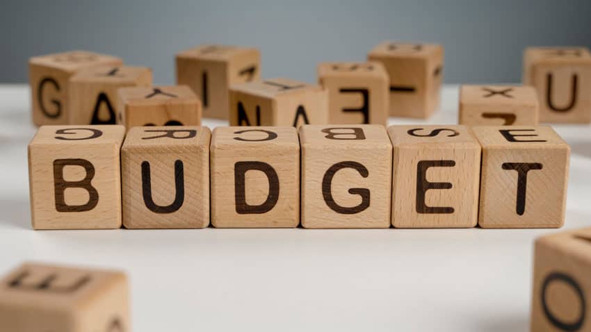
Budget

Your eCommerce site can be overtaxed if you do not have a budgeting strategy backwards. You should look forward to optimal viewing on a budget.
Easy website navigation
A key part of user interface design is navigation, which includes all the user interface components used by your visitors to find specific content on your site. All of the above pages are examples of themed pages that all complement each other. When your e-commerce platform prevents you from using any unique navigation routes, your website will have a nice visual appearance, but most users will have little interest in using it and your sales conversion rate will be negatively affected.
Use high resolution graphics and images

Encourage your UX team to use visual design components like holes, colors, and other aesthetic graphics to give your site a unique look. They may also be used in marketing materials and advertising. By displaying items in a real setting, large and original images can improve image and user experience.
Unique user experience
A satisfied consumer is more likely to make a purchase and then be happier with the purchase. The brand takes it to the next level when consumers experience a sense of joy. Great marketing and promotional tools will do you little good if your site doesn’t engage the visitor. User experience is critical to ensuring the functionality and ease of use of your website. This increases the pleasant aspects of the interaction and influences other positive outcomes.
Choose a website layout that is uncluttered and easy to navigate
Check out the website designs of these online stores. Instead of being cluttered with pop-ups and giant ads, navigation menus simply display the key offers of digital businesses. Make the most of your color choices One of the most powerful tools in your eCommerce brand identity toolkit is color.
Optimize site load time
You can use the above approach to make your website load faster. Reduce time to first byte. Fast TTFB can quickly send components to the web browser, such as HTTP requests, processing requests and response times.
Conclusion
Your website is the showcase of your company. A brand can appear cold and distant if its appearance is outdated and unattractive. The above techniques will encourage customers to spend more time on your e-commerce site, increasing the likelihood of a transaction.


Leave A Comment
You must be logged in to post a comment.